Why do we bother with Statistical Plots?
● The answer to this question is similar to the one for: “why do we bother working out averages and measures of spread?”.
● We live in a world jam-packed full of statistics, and if we were forced to look at all the facts and figures in their raw, untreated form, not only would we probably not be able to make any sense out of them, but there is also a very good chance our heads would explode.
● Statistical Plots – if they are done properly – present those figures in a clear, concise, visually pleasing way, allowing us to make some sense out of the figures, summarise them, and compare them to other sets of data.
1. Drawing the Correct Scale
It never ceases to amaze (or depress) mejust how many people get everything else correct when drawing a statistical plot, but mess up their scale and lose loads of marks!
Remember: When choosing a scale, make sure you always go up in egual steps along each axes!
Here are some examples of some really dodgy scales. See if you can tell what is wrong with each… and make sure you never make the same mistake!
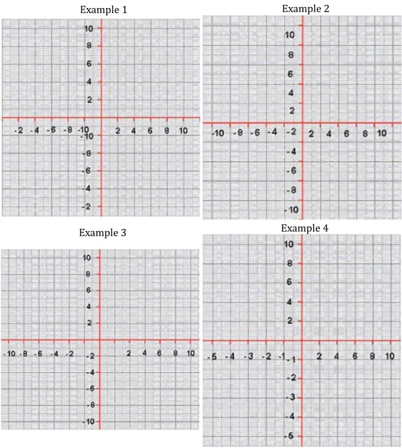
The Answer
Example 1) This person has messed up their negative numbers. Remember, scales must go from smallest to biggest, from left to right, and down to up.
Example 2) Classic mistake. Numbers must go on the lines, not between the spaces!
Example 3) How many times have I seen this? The spaces around the centre (origin) are not egual. Look at the gap between 2 and -2…. Deary me!
Example 4) Inconsistent scales! Notice the numbers go up by 1 in the negatives and then 2 in the positives!
Note: Another mistake in all of the plots is that the x and y axes are not labelled!
Big Example
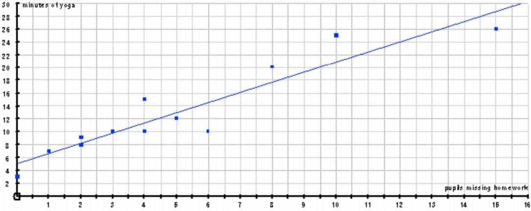
Below is a table showing the number of pupils who fail to hand in their maths homework each day, and the minutes of yoga I need to do to calm myself down
| Pupils missing homework | 3 | 5 | 2 | 10 | 2 | 0 |
|---|---|---|---|---|---|---|
| Minutes of yoga | 10 | 12 | 9 | 25 | 8 | 3 |
| Pupils missing homework | 4 | 8 | 15 | 6 | 1 | 4 |
| Minutes of yoga | 15 | 20 | 26 | 10 | 7 | 10 |
Draw a scatter plot to show the information, add a line of best fit, and comment on the correlation
2. Drawing a Scatter Plot
1. Decide on an appropriate scale that will look a decent size and fit all the data in!
Note: It doesn’t really matter which set of data goes on the x axis and which on the y… but personally I like to put the one with the biggest numbers on the y axis! BUT: remember to label both axes, including units!
2. Carefully mark each piece of data on your plot with a dot/cross, and when you have finished, check you have the correct number of crosses!

3. The Line of Best Fit
This is a single straight line which is supposed to be a good representation of the pattern / trend of the data
Tips for drawing it:
● Try to get roughly the same amount of points above the line as below
● Experiment by using your ruler as your line, and only draw the line in when you are happy
● Don’t spend too long deciding, and don’t try to make it perfect!
Note: Your line does NOT have to start at the origin (0, 0)
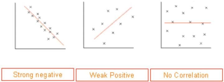
4. Correlation
The most important use of scatter plots is to determine the type (if any) of correlation between two variables.
Correlation is just a posh word for relationship.
There are two categories of correlation that you need to be familiar with:
DIRECTION
Positive — line slopes upwards Strong
As one variable increases, so does the other
Negative – line slopes downwards
As one variable increases, the other decreases
No correlation – line is close to horizontal
No relationship between the variables
STRENGTH
Strong – dots are close to each other
Weak – dots are far apart
Tip: When deciding on the strength of correlation, I have a little rule: “the longer it takes me to decide where to draw the line of best fit, the weaker the correlation”
Looking at our example, I would say there is a fairly strong, positive correlation. This is no surprise, because as the number of missing homeworks increases, so to does my need for yoga!
5. Using your Line of Best Fit
Once we have drawn our line of best fit, we can use it to predict results we don’t already have
Note: the stronger the correlation, the more reliable these predictions will be!
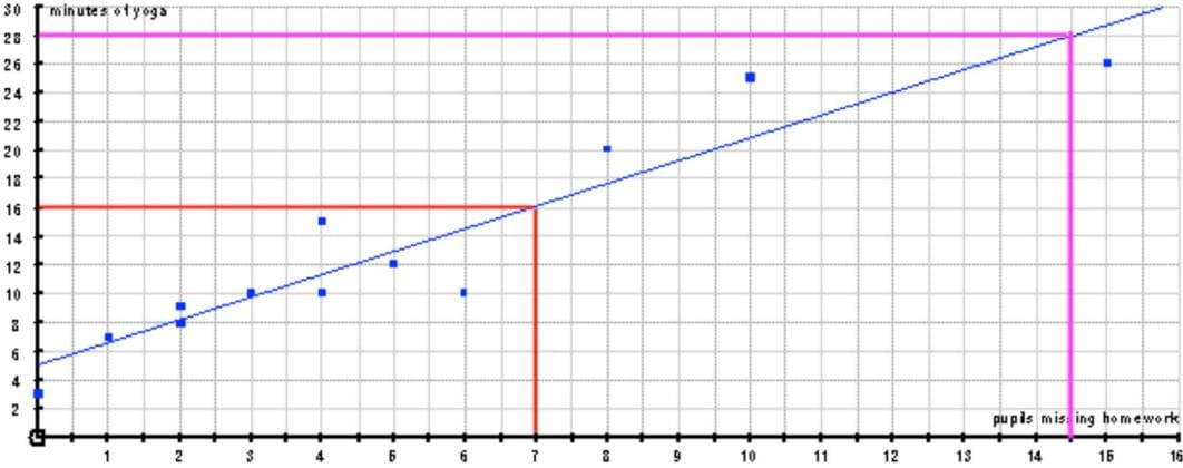
Question 1: If 7 pupils forget to hand in their homework, how many minutes of yoga might Mr Tony do?
Answer:
Following the red line up and across gives… 16 minutes
Question 2: If Mr Tony does 28 minutes of yoga, how many pupils might have forgotten their homework?
Answer:
Following the purple line across and down… 14.5 pupils.
Let’s read next post How to Draw a Scatter Plot and its Linear Regression Line Equation?.

 (10 Examples)")
")
")

