In line chart, observation values are placed on x-axis and its frequency (x,y) will be plotted on the rectangular co-ordinate system, then the two closest point will be connected by a line.
Example 1:
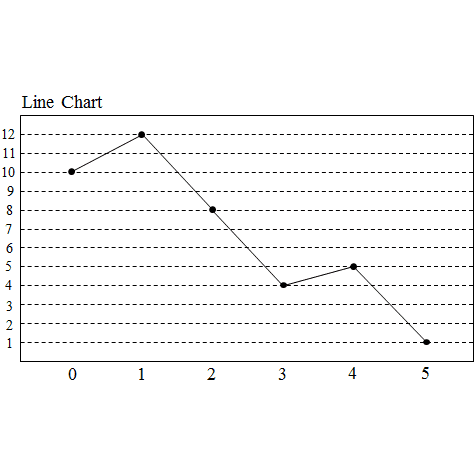
Draw line chart of the data in the following frequent table.
Solution:
The values 0, 1, 2, 3, 4 and 5 are placed on x-axis, and the values of frequency are placed on y-axis. The pairs (x,y) which are (0,10), (1,12), (2,8), (3,4), (4,5) and (5,1) will be plotted on the rectangular co-ordinate system, then the two closest point will be connected by a straight line like the following graph.
Example 2:
Below is data for the prevalence of HIV in South Africa. HIV prevalence refers to the percentage of people between the ages of 15 and 49 who are infected with HIV.
Draw a frequency polygon of this data set.
Solution:
Frequency polygons
We can also make a frequency polygon by using this line chart. A frequency polygon uses lines to join the mid-points of each interval. The polygon must begin and end on the horizontal axis. So we can add an interval at the beginning and the end of the data which both have a frequency of 0.
A histogram is a graphical display of data using bars of different heights. It is similar to a bar graph but for a histogram there are no gaps between the bars.
Note: Notice the polygon shape. This one has 6 sides, including the x-axis.
The frequency polygon can also be drawn using the midpoints of the bars of the histogram, as shown below.
Frequency polygons are useful to compare the distribution of two or more sets of data on the same set of axes.
Hint: To plot a frequency polygon:
● Plot midpoints of each interval
● Join the midpoints by straight lines
● Add an interval at the beginning and end of the data, with both frequencies equals to 0.
● Frequency polygon is a closed figure, hence must start and end at the x-axis.
Histograms and Frequency Polygons
It is often useful to look at the frequency with which certain values fall in pre-set groups or classes of specified sizes. The choice of the groups should be such that they help highlight features in the data. If these grouped values are plotted in a manner similar to a bar graph, then the resulting graph is known as a histogram. Examples of histograms are shown in Figure A1 for Data Set A, with group sizes of 1 and 2.
This table: Frequency table for Data Set A, with a group size of 1.
This table: Frequency table for Data Set A, with a group size of 2.
The same data used to plot a histogram are used to plot a frequency polygon, except the pair of data values are plotted as a point and the points are joined with straight lines. The frequency polygons for the histograms in Figure A1 are shown in Figure A2.
Unlike histograms, many frequency polygons can be plotted together to compare several frequency distributions, provided that the data has been grouped in the same way and provide a clear way to compare multiple datasets.
Figure A1: Examples of histograms for Data Set A, with a group size =1 (left) and a group size =2 (right). The scales on the y-axis for each graph are the same, and the values in the graph on the right are higher than the values of the graph on the left.
Figure A2: Examples of histograms for Data Set A, with a group size =1 (left) and a group size =2 (right). The scales on the y-axis for each graph are the same, and the values in the graph on the right are higher than the values of the graph on the left.
Line and Broken Line Charts
All graphs that have been studied until this point (bar, compound bar, histogram, frequency polygon and pie) are drawn from grouped data. The graphs that will be studied in this section are drawn from the ungrouped or raw data.
Line and broken Line Charts are plots of a dependent variable as a function of an independent variable, e.g. the average global temperature as a function of time, or the average rainfall in a country as a function of season.
Usually a line graph is plotted after a table has been provided showing the relationship between the two variables in the form of pairs. Just as in (x,y) graphs, each of the pairs results in a specific point on the graph, and being a line graph these points are connected to one another by a line.
Many other Line Charts exist; they all connect the points by lines, not necessarily straight lines. Sometimes polynomials, for example, are used to describe approximately the basic relationship between the given pairs of variables, and between these points.
Worked Example: Line Chart
Question: Clawde the cat is overweight and her owners have decided to put her on a restricted eating plan. Her mass is measured once a month and is tabulated below. Draw a line graph of the data to determine whether the restricted eating plan is working.
Answer:
Step 1: Determine what is required
We are required to plot a line chart to determine whether the restricted eating plan is helping Clawde the cat lose weight. We are given all the information that we need to plot the line chart.
Step 2: Plot the line chart
Step 3: Analyse the Chart
There is a slight decrease of mass from March to October, so the restricted eating plan is working, but very slowly.
Graphical Representation of Frequency Distributions
(i) Bar Graphs (← visit here)
(ii) Histograms (← visit here)
(iii) Pie Charts (← visit here)
(iv) Frequency Polygon To draw the frequency polygon of an ungrouped frequency distribution, we plot the points with abscissa as the variate values and the ordinate as the corresponding frequencies. These plotted points are joined by straight lines to obtain the frequency polygon.
(v) Cumulative Frequency Curve (Ogive) Ogive is the graphical representation of the cumulative frequency distribution. There are two methods of constructing an Ogive, viz (i) the ‘less than’ method (ii) the ‘more than’ method.


 (10 Examples)")

