Graphical Representation of Frequency Distributions
(i) Bar Graphs
(ii) Histograms
(iii) Pie Charts. Pie Charts are used to represent a relative frequency distribution. A pie diagram consists of a circle divided into as many sectors as there are classes in a frequency distribution.
The area of each sector is proportional to the relative frequency of the class. Now, we make angles at the centre proportional to the relative frequencies.
And in order to get the angles of the desired sectors, we divide 360° in the proportion of the various relative frequencies. That is,
Central angle = [Frequency ×360°÷ Total frequency]
Big Example
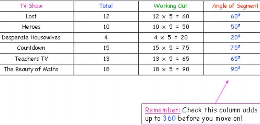
A group of 72 maths teachers were asked to choose their favourite TV show from a list,
and their responses areshown in the table below. Construct a pie chart to Illustrate
this information.
1. Working out the Angles
● Before you can start to draw the pie chart, you need to know how big a slice each of the choices is going to take up – in other words, you need to know the angle of each segment
● To work this out, you need to remember that there are 360 degrees in a circle
● That means there are 360 degrees to share between each of the people who took part in the survey
● How many degrees does each person get?… Well, divide 360 by the number of people surveyed!
To Calculate the Angles
i. Add up the total number of pieces of data
ii. Divide 360 by this number – this tells you how many degrees is allocated to each piece of data
iii. To work out the size of angle for each category, multiply the answer to 2. by the number of people in each category – rounding your answers sensibly if you need to.
iv. Check: Before you start to draw, make sure you check that your total number of degrees does add up to 360!
Our Example:
a). So, we have a total of 72 teachers who were surveyed.
b). 360+72=5 So… each teacher is worth 5 degrees on our pie chart
c). We know how many teachers are in each segment, so let’s use our answer to (2.) to work out what angle each segment gets
2. Drawing the Pie Chart
You’ve done all the hard work, and drawing the pie chart should be easy… but you’ll be amazed how many people mess it up, so take your time and follow these steps…
i. Draw a circle using a compass. Mark the centre with a dot and draw a straight line from the centre up to the right of your circle.
ii. Carefully place your angle measurer along the line, with the centre exactly on the centre of the circle. Now, count around from 0 until you reach the correct number of degrees – in this case 60° – and place a dot
iii. Join up your dot to the centre with a straight line, and label your segment.
iv. Now, this is the tricky bit… Turn your pie chart clockwise until our new line is horizontal (where the first line used to be). Now you can mark your next angle in exactly the same way.
v. Keep doing this until you have drawn all your segments
Check: You will know if you have got it right if the line to make your final segment is the very first line you drew!
vi. If you wont to you can colour in your segments, but you must remember to label them clearly, or add a key!
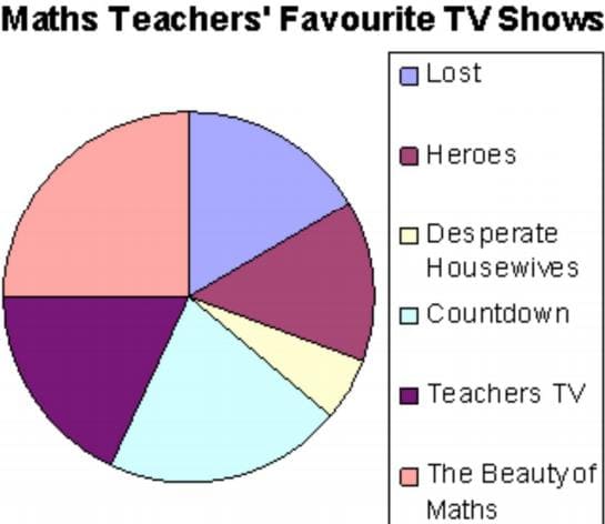
3. What CAN we tell from Pie Charts
● Well, if you look back at our pie chart, you will see that it shows pretty clearly that the Beauty of Maths was the most popular choice amongst our maths teachers, whereas Desperate Housewives was the least popular
● If you want to be really fancy, you might be able to say things like: “roughly 3 times as many teachers preferred Lost to Desperate Housewives”
4. What CAN’t we tell from Pie Charts
● Well, imagine we were just given our pie chart (and no original data), and someone said: “how many maths teachers said that Countdown was their favourite show?”, what would we say?…
● Well, probably not a lot, because there is no way of knowing!
● Unless we are told how many people were surveyed all together, we cannot answer that question!
● When making statements based on Pie Charts, just make sure what you are saying is definitely, 100% true!
5. Interpreting Pie Charts
Big Example 2
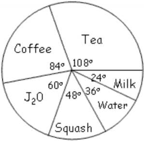
240 Math teachers were asked “what is your favourite drink?” and a pie chart was drawn to show to information.
Work out how many teachers preferred coffee
To answer this question we must do the opposite of what we did when we were drawing the pie chart – we must use our angles to find our totals!
Let’s look at coffee… it takes up 84° out of 360°, and what we want to know is “how much does it take up out of our 240 people?”
Well, what about using this as an excuse to show off our Algebra skills! …
So, turning to our calculator, we get an answer of… 56 people
Pie Charts
A pie chart is a graph that is used to show what categories make up a specific section of the data, and what the contribution each category makes to the entire set of data. A pie chart is based on a circle, and each category is represented as a wedge of the circle or alternatively as a slice of the pie. The area of each wedge is proportional to the ratio of that specific category to the total number of data values in the data set. The wedges are usually shown in different colours to make the distinction between the different categories easier.
This Figure: Example of a pie chart for Data Set 1. Pie charts show what contribution each group makes to the total data set.
Method: Drawing a pie-chart
1. Draw a circle that represents the entire data set.
2. Calculate what proportion of 360° each category corresponds to according to
3. Draw a wedge corresponding to the angular contribution.
4. Check that the total degrees for the different wedges adds up to close to 360°.
Worked Example: Pie Chart
Question: Draw a pie chart for Data Set A, showing the relative proportions of each data value to the total.
Answer
Step 1 : Determine the frequency table for Data Set A.
Step 2 : Calculate the angular size of the wedge for each data value
Step 3 : Draw the pie, with the size of each wedge as calculated above.
Pie Chart for Data Set A
Note that the total angular size of the wedges may not add up to exactly 360° because of rounding.
Presenting data by using pie chart
In pie chart (or pie graph or circular graph) there are some sections. Each section represents a group of observation values. The angle size of that section represents frequency of drawn observation value. In this case, the whole data (total of frequency) is equivalent to 360°.
Example 1:
Draw pie chart of data which is presented in this following frequent table.
Solution:
The section angle of each observation value can be determined as the following.
With the results obtained above, the pie chart of the data, can be drawn such as the following.
The pie chart:
Example 2:
The selling of a certain product is presented in the following table.
Draw bar chart and pie chart based on the data.
Solution:
The pie chart
Exercises about Pie Charts
Intruction: Choose the one correct answer for each question.
Use the following pie chart to answer question 1-3.
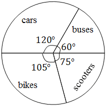
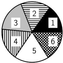
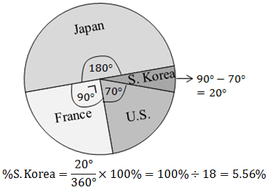
The following pie chart representsthe grouping of car which park on a field based on the country where cars made.
1. Which country of that cars made from are mostly parking on that field?
A. U.S. B. France C. Japan
D. South Korea E. Australia
Key: C
2. If there are 72 cars made in Japan, then the number of cars made in U.S. is ….
A. 8 B. 10 C. 12 D. 28 E. 36
Key: D, solution:
3. How big is the percentage of Korean’s cars?
A. 3.56% B. 4.56% C. 5.56%
D. 6.56% E. 7.56%
Key: C, solution:
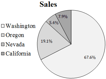
Use data in the following pie chart to answer question 4-5.
The following pie chart represents the profit of 4 companies in the last year. For example the profit of company A is equal to USD 1.275 billion.
4. The profit of company B is equal to USD … billion.
A. 1.75 B. 1.85 C. 1.90 D. 2.15 E. 2.25
Key: , solution:
5. The total profit of that 4 companies is equal to USD … billion.
A. 5.4 B. 4.4 C. 3.4 D. 2.4 E. 1.4
Intruction: Solve the following problems correctly.
6. Data in the following frequency table are the weekly wages of 50 employees in a company.
Draw pie chart based on the data.
Using Microsoft PowerPoint to draw the pie chart easily.
More about organising data
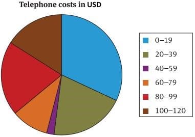
The following table shows the costs (in USD) of 50 new members of a cellphone company. The company would like touse the data to help with its planning.
When large amounts of data need to be studied and interpreted, it is sometimes necessary to group the data, and then study the each group.
It is important to decide how many groups you would like to use before you start organising the data. In this case, we will use six groups for the data.
The size of each group is: largest value – smallest value divided by the number of groups.
Group Slze:
The next step is to draw up a frequency table.
Estimated average
Arithmetic mean
We can represent this data graphically in a histogram or a frequency polygon.
We can also represent the data in a pie chart, as follows.


")
")

